Not everyone thinks of the same color variety when they hear “sky blue” or “scarlet.” Thus, for the global printing industry to thrive, creatives needed to find a way to agree on standardized, exact shades of color that could be shared, repeated, and agreed on without variance.
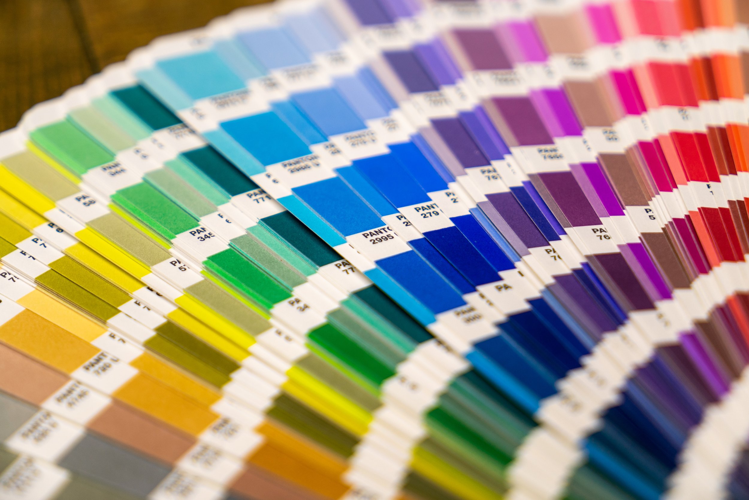
Enter The Pantone Color Chart, or PMS (Pantone Matching System), a standardized color reproduction system developed by the Pantone company.
Specifically, the goal of developing PMS was:
- Standardized Color Reproduction: The Pantone Color Chart provides a set of standardized colors, each identified by a unique code (e.g., PMS 186, PMS 2935). This guarantees that all involved in the printing process (including graphic design, fashion, textiles, and product manufacturing) use precisely the same color reference, reducing the risk of inconsistencies.
- Exact Color Matching: Different printing technology, ink, and garments can contribute to slight variations in a color’s appearance. With the PMS Chart as a north star designers and printers can achieve precise color matching across paper, fabric, plastics, and other surfaces.
- Consistent Branding: With regard to brand guidelines, maintaining consistent brand colors is essential. The PMS Chart makes consistency possible.
- Printing Accuracy: Each Pantone color has specific ink formulations, making it easier for printers to mix colors as specified.
- Spot Color Printing: PMS is especially valuable for spot color printing. In this method, each color is printed separately using its unique ink, resulting in vibrant and consistent colors.
- Extensive Color Range: The Pantone Color Chart offers a wide range of colors, including solid colors, metallics, fluorescents, and pastels. This extensive color palette allows designers to choose from a vast array of shades for their projects.
In summary, the Pantone Color Chart is a crucial tool for myriad reasons. That said, as a client or even as a designer, you don’t need to know color codes or own your own PMS wheel. All you need to do is know what you like.
When you contact FIre Sign with a design for your Summer drop, just include color references that we can match using PMS. We’ll create a proof for you based on your references with the coordinating PMS color codes. And you will be confident that when we print, the final product will match the proof that you approved.

